Your Cart is Empty
SIGN UP & GET 10% OFF YOUR FIRST ORDER -SHOP NOW
February 19, 2019 11 Comments
It was always a dream of mine to live on acreage. All that open space, room for the kids to play and explore. and a bit of healthy distance from the neighbours. We found a beautiful, relatively unknown pocket of acreage properties five minutes from our current home, and after a long five-month negotiation, we were the the proud owners of a 25 year old brick home on over two acres of land.
But the appeal stopped there. While the area was gorgeous and the block was just what we wanted, the house was typical of those built in the early 80s - miles and miles of exposed brick, pine timber lining boards and black slate floors. Which I'm sure was the height of fashion at the time, but it made for a really dark and dingy interior. I really craved light, bright, airy rooms, with a lovely, Hamptons style vibe. Sadly, this house didn't deliver on any front, but the bones were good and I knew with a little elbow grease and a few hundred litres of white paint, we could transform this ugly duckling into a beautiful Hamptons style swan.
It took a while but we eventually renovated the whole house - inside and out, top to bottom - and we did the majority of it ourselves. So if you're looking at some inspiration on how to get the Hamptons look, read on. But be warned, this is warts-and-all, and trust me when I say the before pics definitely aren't pretty! The changes were pretty substantial and there wasn't an inch of the house that wasn't touched so I'll break up the info into a couple of posts. This is part one - the interiors. I've also linked all of the artwork used in this makeover at the end of this post, so if you want to get the look for yourself you'll find everything in one place!
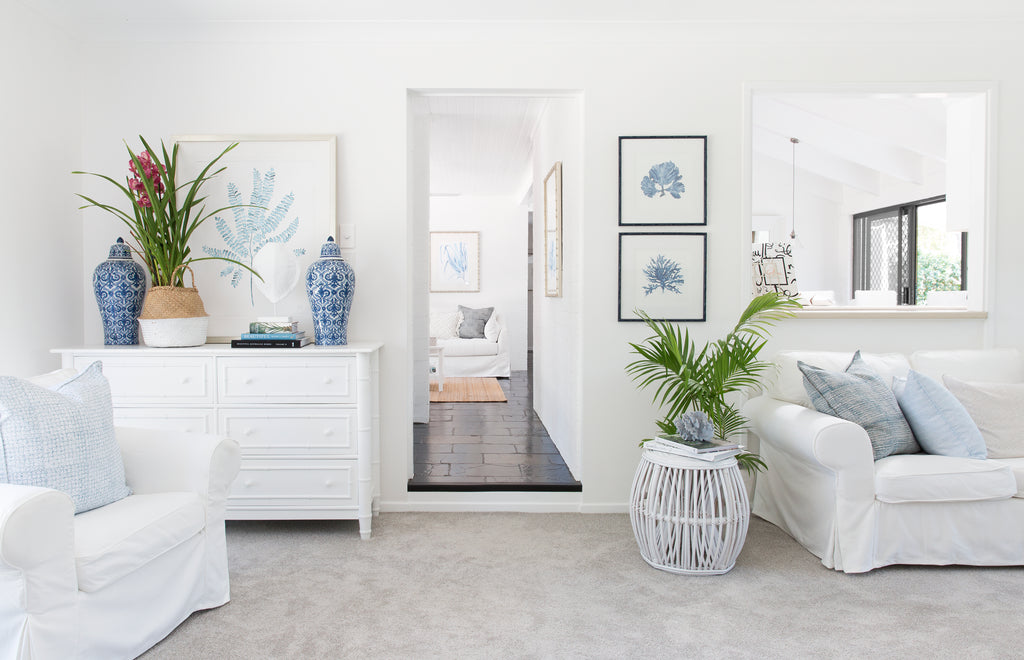
My Pale Blue Foliage Print is the focal point in this sitting area. Centered over the console, it mirrors the blues used in the cushions and accessories. It also works really well with my Coral Prints in Denim Blue as seen on the right.
The formal living and sitting rooms were the only areas of the existing house that didn't have exposed brick or pine ceilings, so they were the easiest areas of the house to renovate. Fresh paint (Dulux Lexicon Quarter), new carpet, and a makeover of the fireplace meant that I had a blank canvas to work with. All that was needed was to add the finishing touches - some of my Fern and Coral artworks, soft furnishings, plants and styling and it looked fantastic.
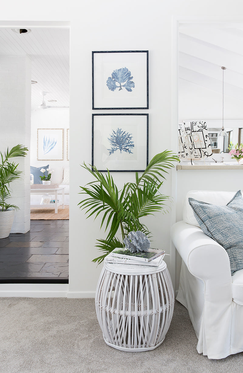
My Sea Coral III and Seaweed II wall art prints in Denim Blue were paired with custom hand-painted bamboo frames in a gloss navy. The custom colour really added punch and it's something that anyone can do to store-bought frames for a personalised touch.
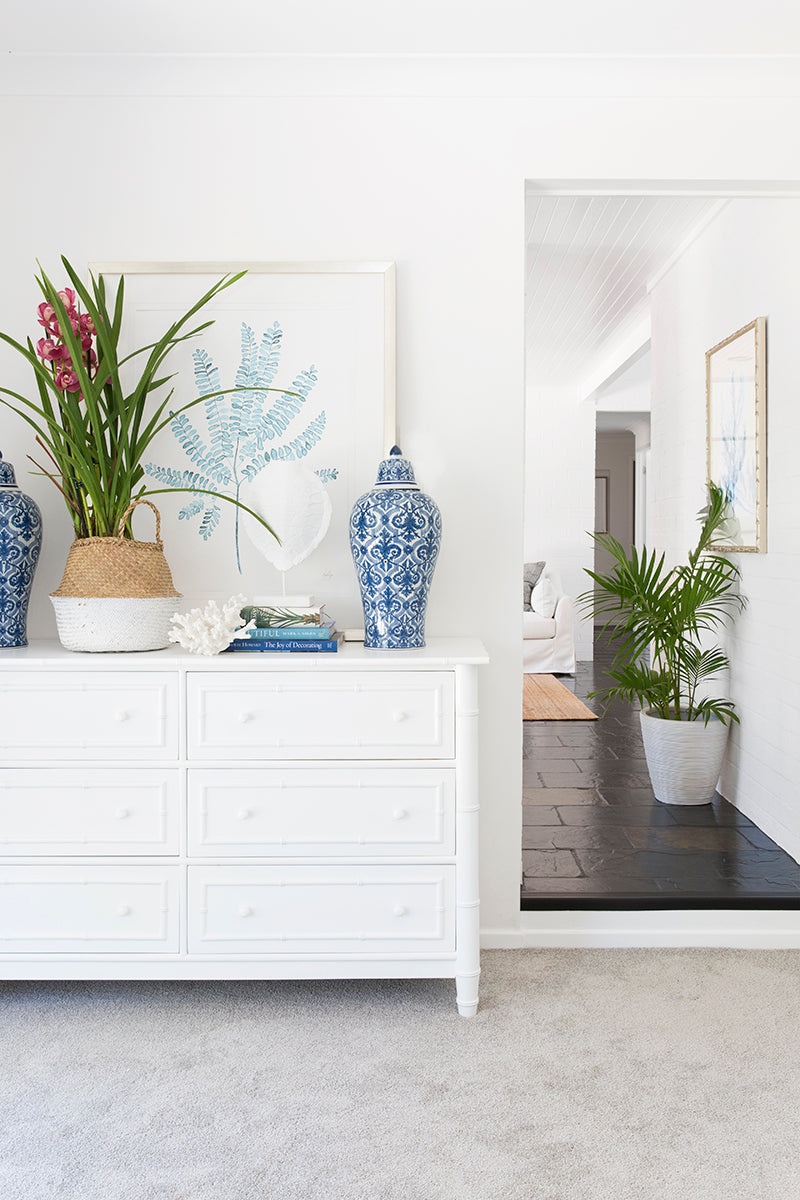
My Foliage print in Pale Blue was the perfect choice for this vignette. I decided to lean the artwork against the wall rather than hanging it for a more relaxed and informal look. It's also great for renters - no holes in the wall and no problem when it comes time to move on.
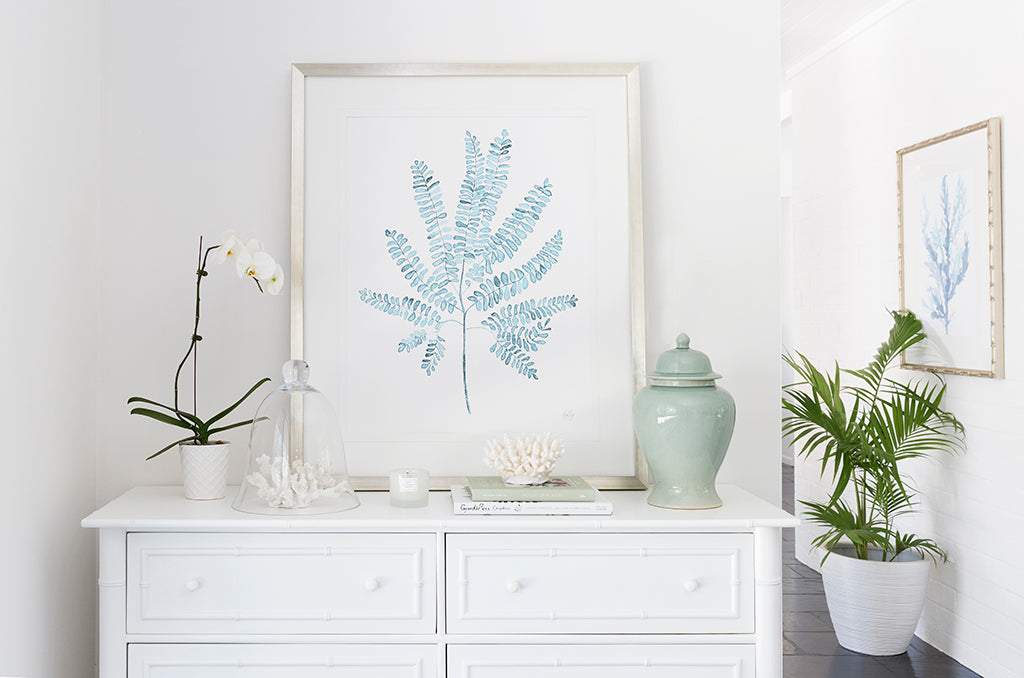
Corals, flowers and books are my go-to styling additions. I love adding natural elements to a room, whether it's an orchid as shown here, or say a palm or fiddle-leaf fig in a pot. Bringing the outdoors inside makes the room feel fresh and inviting.

Over the years, the fireplace had discoloured and it needed a little refresh. We gave it a fresh coat of black heat resistant paint and the brick hearth was also painted in white to give a cohesive look.
As you can see, our beautiful pup didn't mind the ugly fireplace at all! But he was definitely on his own there.
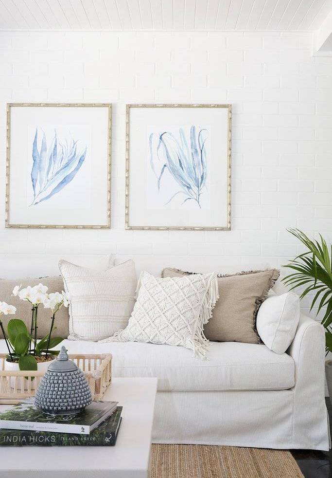
After sealing and undercoating the brick walls (a big job but it's crucial to do the prep work if you want a good finish) we then used Dulux Lexicon Quarter on all of the international walls. Once the dark bricks were covered, it was time to add the furniture and decorate - my favourite part. This sofa is the Farlov 3-seater sofa from Ikea with the white loose cover. It was the perfect size for the space and I paired it with a jute rug from Freedom. I love using natural fibre rugs - they add a lovely texture and are very forgiving. Cushions, favourite coffee table books, orchids and accessories always make the space feel personal.
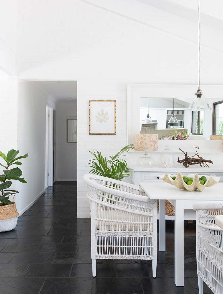
Malawi chairs, rattan baskets and potted plants added interest and texture to the dining space. I added my Tropical Leaf in Natural print in a custom antique gold bamboo frame, as a nice contrast to the blues in the other art and cushions. And an oversized white timber mirror (both this and the console table underneath were originally stained timber but were also given the white paint treatment) reflects the pool and bushland outside. It's amazing how much better the slate floors looked once the walls and ceilings were white. After wanting to rip them out for years, I actually found myself liking them.
Urgh! Dark and dingy and very depressing.

My Pastel Seaweed II Wall Art Print is part of my range for Designer Boys and the soft blue colour was the perfect way to lift this once dark entry.
The entry was originally a dark, uninviting space that said the very opposite of 'welcome'. We bagged the brick wall and painted it white, added a feature artwork and painted the front door a high-gloss black (Taubmans Endure Gloss in All Black). We also painted the pine ceiling in a crisp white (Dulux Vivid White) as well, as a fresh contrast to the dark slate floor. New chrome hardware was the perfect door 'jewellery'.
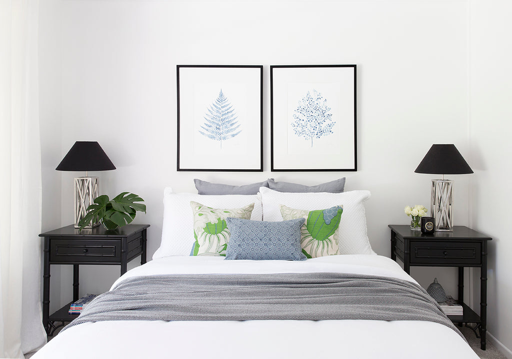
The master bedroom was also painted white (Dulux Lexicon Quarter) and I added crisp white linen sheets and curtains for a luxurious but natural feel. Black Chinoiserie bedside tables, black timber frames for my Fern Prints in Denim, and custom cushions via Rachel Elizabeth Interiors complete the look. Fresh foliage and flowers are always a good idea, and stacks of books and magazines are perfect finishing touches.
Now, if any of you are still reading from way back in the days of my very first blog, may remember that back in 2010, I did a mini DIY kitchen makeover. You can read through the previous post to see all the gory before shots, but when it came to this renovation the previous update still looked great and we really didn't need to do too much to it. A fresh coat of paint throughout, new lights and a little styling and it was done.
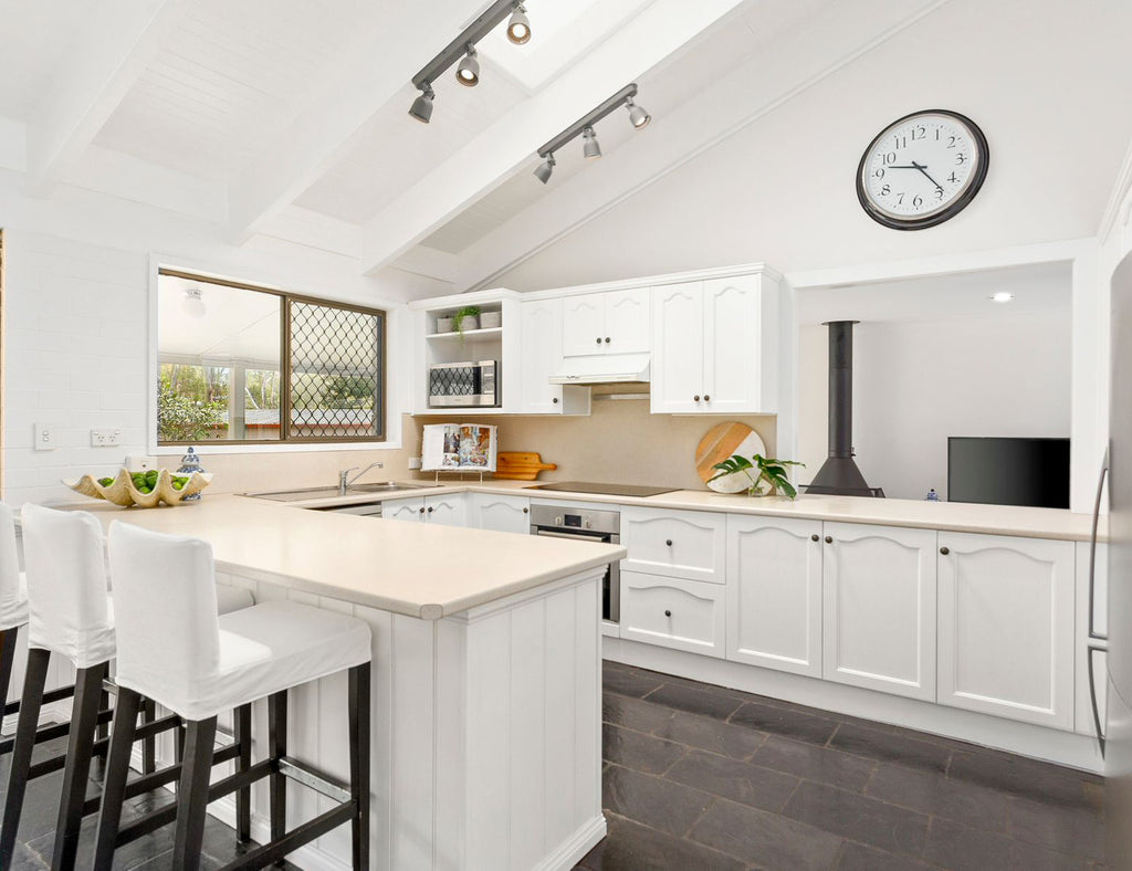
The kitchen was given a fresh coat of Dulux Vivid White paint on ceilings and the previously painted cabinetry, and the walls were painted Dulux Lexicon Quarter. We had already updated the oven and cooktop so these were almost new.
I don't want to hurt your eyes but here's just a couple of shots of the kitchen in it's original state, taken before the first makeover. Timber on timber on slate on brick - you get the picture.
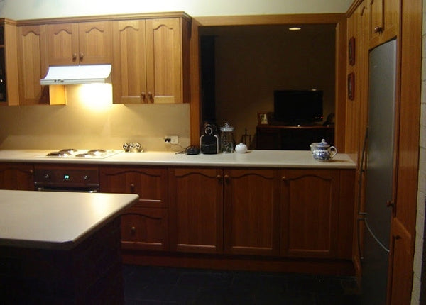
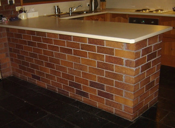
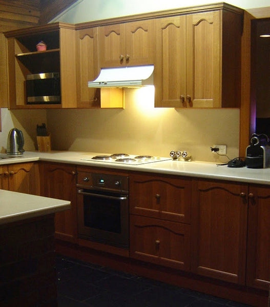
By far the biggest and most dramatic changes were all down to paint, and covering the internal brick walls and timber ceilings in a fresh, bright white made such a difference to how the whole house looked and felt. I've said it before and I'll say it again; never underestimate the power of paint - it's a renovator's best friend. To be fair, we did lay new carpet as it really needed replacing, and the slate floors were stripped and resealed but the new paintwork was a complete game changer.
In part two of this blog series, I'll share the changes we made to the exterior. If you think the interior looks good, wait until you see outside. It really looks like a completely different house and even friends and family didn't believe it was the same place.
Here are all of the prints I used in this renovation - feel free to ask any questions at all about size, framing etc :)
February 14, 2022
For those asking about the carpet, it’s a light silver grey plush pile. I can’t find the details but it was from Harvey Norman. If I dig up the receipt I’ll post the details here :)
February 14, 2022
Hi Esther, thanks so much! The fireplace is original to the house and it’s often called a Malm or cone fireplace. I think you can still buy them and they come in lots of colours. Or you could look for a vintage one online. Hope that helps :)
February 14, 2022
Hi Sherry, thanks so much! The pendant lights were actually from Bunnings and I think they still have similar ones available.
January 14, 2022
Gorgeous! Can you tell me who makes those glass pendant lights?
March 01, 2021
Incredible transformation! Who knew slate floors could look so good. I’m dying to see the before and after photos of the exterior of your house. Where can I find these?
June 05, 2020
I just love your colour scheme . Could you tell me what brand of carpet you used its just what I am looking for. Is it a blue grey or just grey. Did you repurpose you existing furniture with white paint (if so what colour etc) as I want to achieve the hamptons look but by using my existing dark pine furniture which I think would come up really well
June 05, 2020
This looks amazing. I would love to know what colour carpet you put in the formal living and sitting room.
March 16, 2020
Hi Kerri, absolutely beautiful, all your hard work paid off. Do you have any idea what the fireplace is called, I simply love it. Also, the glass pendants, where can I get those please. We are about to embark on our retirement home and have similar ideas. Thank you & best wishes for Christmas
March 04, 2019
Hi Donna,
What a lovely message – thanks so much! It was always a house with great bones but the dark and dated interiors really let it down. The power of white paint is pretty amazing so if you find a place that ticks all the boxes except for the interior details then I say go for it – nothing that paint and a bit of effort can’t fix :)
March 04, 2019
I know it’s been a while since you posted this but I’ve seen the pics a few times on Pintrest etc so it’s time to comment and say what a great job you’ve done. And it’s so refreshing to see such a great job achieved on a normal budget. I loved the original elements you’ve kept and of course your artwork (I have two of your indigo coral prints in my lounge). I’m with you on the floors. They look great and I’ve actually used your pics to inspire a friend with the same floors. I need a bigger house to accommodate growing kids, hopefully I’ll find a diamond in the rough like you. I’ll be over the moon if it ended up looking half as good as yours.
Comments will be approved before showing up.

July 18, 2022

Coastal Grandmother Style - what is it and how you can get 2022's most viral trend for yourself!

July 18, 2022
How to Choose the Perfect Wall Art - Our Pro Tips & Tricks to getting it right every time

July 05, 2022

What is Hampton Style and how do I get it? The Ultimate Guide to Hamptons Style Interiors
Join our VIP club for the latest on new arrivals, VIP-only sales and more!
Bre Cerqueira
May 27, 2022
Hi,
I absolute love your work! I’ve just purchased a 1992 home in the gold coast that has the exact same slate tiles. Been contemplating ripping them out but after seeing your reno, I’m changing my mind. Did you do anything to your tiles, like paint them? If so, what did you do? Also, where about in Aus are you? Thank you! Can’t wait to hear from you!